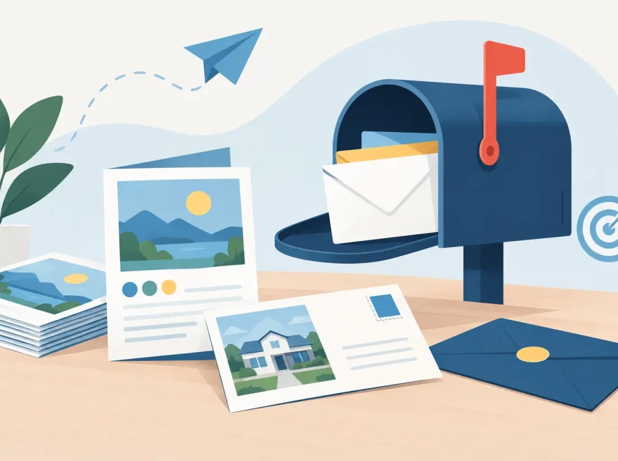
A homeowner pulls in the mail after work and gives your postcard about three seconds before deciding whether it goes on the counter or into the recycling bin. That is the real design brief. When learning how to design a direct mail postcard, the goal is not to fit every detail about your business onto a small piece of paper. It is to make one clear offer feel relevant enough to act on now.
For local businesses, real estate professionals, and growing service brands, postcards can put a message directly in front of the right neighborhoods without asking people to open an envelope or click an ad. But print has no edit button after production begins. A well-designed postcard needs a focused message, smart use of space, accurate mailing details, and files built correctly for print.
Start With One Campaign Goal
The strongest postcards do one job. They introduce a new location, promote a seasonal service, announce an event, generate estimates, drive online orders, or keep a brand visible in a target area. Trying to accomplish all of those at once creates a crowded piece that asks the reader to do nothing.
Choose the action you want the recipient to take before writing a headline. A roofing company may want storm-damage inspections. A restaurant may want weekday lunch traffic. A real estate agent may want homeowners to request a market valuation. The campaign goal determines the offer, call to action, audience, and even the most effective postcard size.
Your offer should give people a reason to respond now. That does not always mean a deep discount. A limited-time consultation, a free local delivery offer, an invitation to an open house, or a seasonal deadline can be just as effective. Keep the terms easy to understand. If the offer needs a paragraph of explanation, simplify it before you design.
How to Design a Direct Mail Postcard for Fast Reading
A postcard is not a brochure. Recipients should understand the main idea at a glance, even if they only scan the front while standing at the mailbox. Build the design around a clear visual hierarchy: headline first, supporting image or benefit second, and call to action third.
Give the headline the most space
Lead with a result your audience cares about, not a generic description of your company. “Save on Summer AC Service” is more immediate than “Your Trusted HVAC Provider.” “Thinking of Selling This Year?” is more compelling than “Local Real Estate Services.”
Use a large, readable typeface and enough contrast between text and background. Light gray copy on a white photo may look subtle on screen but disappear in print. Likewise, decorative fonts may fit a brand personality, but they should not carry essential information such as an offer code, phone number, or deadline.
Use images that prove the message
One strong image usually outperforms a collection of small photos. Show the finished kitchen, the clean storefront, the team at work, the featured menu item, or the property exterior. Use images that feel local and specific rather than generic stock imagery when possible.
People also respond to visual evidence. Before-and-after images, a recognizable neighborhood scene, a product in use, or a photo of the business owner can help establish credibility quickly. If your service is difficult to photograph, let a bold headline and clean branded color do more of the work.
Keep copy short and useful
The front of the postcard should create interest. The back can provide the practical details, but it still needs breathing room. Write in plain language and focus on two or three customer benefits. Avoid dense paragraphs, technical jargon, and a long company history.
A useful formula is simple: identify the need, present the offer, then show the next step. For example: “Planning a backyard upgrade? Schedule your free design consultation by May 31. Call or scan to reserve your appointment.”
Make the Call to Action Impossible to Miss
Every postcard needs a specific next step. “Contact us” is acceptable, but it is less persuasive than “Call today for a free estimate,” “Bring this card in for 15% off,” or “Scan to view available homes.”
Place your main call to action where the eye naturally lands, often near the bottom of the design or beside the offer. Repeat a phone number or web address if needed, but do not create competing actions. If you include a QR code, give it a clear purpose and a plain-language instruction. “Scan for your neighborhood offer” is better than placing an unexplained code in a corner.
QR codes work best when they lead to a mobile-friendly page that continues the same offer shown on the card. Test the code from a printed proof or a full-size sample. A code that is too small, placed over a busy image, or linked to a slow page can cost responses.
Plan the Mailing Side Before Finalizing the Layout
Direct mail design has practical requirements that cannot be treated as an afterthought. The mailing panel needs space for the recipient address, postage, and required postal markings. If you are using Every Door Direct Mail, the format and indicia requirements differ from a targeted mailing list campaign.
Reserve a clean mailing area early in the design process. Do not place key copy, a face, or a detailed background image where addressing information will print. The back of the card often includes the mailing panel, but the exact placement depends on the mailing format, size, and postal preparation method.
This is where working with a print and mail partner can prevent expensive revisions. Pink Hippo can help coordinate postcard printing, mailing setup, and EDDM execution so the artwork supports the way your campaign will actually be mailed.
Choose a Size and Stock That Support the Message
Postcard size affects both visibility and budget. A standard 4 x 6 postcard can be a smart choice for simple promotions, reminders, and high-volume campaigns. Larger formats, such as 6 x 9 or 6 x 11, give you more room for photography, offers, testimonials, and stronger mailbox presence.
Bigger is not automatically better. If your message is concise and your budget depends on reaching more homes, a smaller card may produce better overall value. If you are marketing a higher-ticket service or need to explain a multi-part offer, the additional space of a larger card can be worth it.
Paper stock matters, too. A heavier stock feels more substantial and can reinforce a premium brand. Gloss coating can make full-color photos pop, while matte finishes offer a more understated look and may be easier to write on. Consider how the card will be used. A coupon, appointment reminder, or referral card may need writable space. A visually driven retail promotion may benefit from a gloss finish.
Build Files for Print, Not Just for the Screen
A design can look excellent on a monitor and still print poorly if the file is not prepared correctly. Use high-resolution images, ideally 300 dpi at final size. Low-resolution logos and photos can appear blurry or pixelated once printed.
Set artwork in CMYK color mode when possible. Screens display color using RGB light, while commercial printing uses ink. Bright neon-like colors and highly saturated blues or greens may shift during conversion, so review a proof if precise brand color is essential.
Extend background colors and images beyond the trim edge with bleed. A common bleed allowance is 0.125 inch on each side, though production specifications should always guide the final setup. Keep text, logos, phone numbers, and QR codes safely inside the trim area so they are not cut too close to the edge.
Before approving production, check every detail: offer expiration date, spelling, website or landing page, phone number, address, promo code, mailing panel, and legal language. Have someone unfamiliar with the project review it, too. Fresh eyes catch mistakes that a design team may overlook after multiple rounds of edits.
Target the Right Homes and Measure the Response
A beautiful postcard sent to the wrong audience is still a weak campaign. Define the neighborhoods, ZIP Codes, household types, or customer segments most likely to need what you offer. EDDM can be especially effective when your service area is geographic and you want broad local reach. Targeted lists can make more sense when demographics, past customer behavior, or business types matter more than street-by-street coverage.
Track results with a unique offer code, dedicated phone number, campaign-specific landing page, or QR code. Ask new customers how they heard about you, then record the answer consistently. Response rates are useful, but do not stop there. Consider average sale value, repeat business, and the total revenue generated from each mailing.
Testing is how direct mail improves. Try two headlines, offers, images, or audience areas, but change only one major element at a time. A clear test gives you a usable answer for the next drop instead of a pile of guesses.
The best postcard is not the one with the most design flourishes. It is the one a local customer understands quickly, trusts, and keeps long enough to respond. Start with a focused offer, protect the mailing requirements, and give every element a job. Then let the print quality and follow-through make your first impression count.