A brochure that feels thin, a postcard that arrives after the promotion ends, or a banner with the wrong logo can turn a smart marketing idea into wasted budget. This commercial printing buying guide helps you make confident choices before your project reaches production, whether you need everyday business collateral, event signage, or a neighborhood direct mail campaign.
The right print order is not always the cheapest option on the first quote. It is the option that matches the job, represents your brand well, and arrives when your team needs it. A little planning around format, paper, quantity, artwork, and distribution prevents the most common and most expensive surprises.
Start With the Job, Not the Product
Before comparing postcard sizes or paper stocks, decide what the piece needs to accomplish. A real estate agent announcing a new listing has different needs than a service company building repeat business or a marketing team preparing for a trade show.
Ask where the piece will be seen, how long it needs to last, and what action you want the recipient to take. A menu handled every day needs a durable finish. A sales flyer may need room for a clear offer and QR code. A yard sign has to remain readable from the street, often in changing weather. If the goal is direct response, the call to action and mailing plan matter as much as the printed piece itself.
This decision also helps determine whether standard online ordering is enough or whether your project deserves hands-on support. A straightforward run of business cards is usually simple. A coordinated campaign with postcards, envelopes, mailing lists, inserts, and event signage benefits from one production partner who can keep the details aligned.
Choose the Right Commercial Printing Format
Format affects cost, visibility, mailing eligibility, and how easily people can use your piece. Bigger is not automatically better. A compact postcard may be the better choice when you want a clean offer, a bold image, and a fast read. A booklet gives you room to explain services, show case studies, or present a product catalog without crowding every page.
For common business needs, start with the practical purpose:
- Business cards, letterhead, and envelopes support consistent day-to-day brand presentation.
- Flyers and brochures work well for service menus, offers, handouts, and leave-behind marketing.
- Postcards are built for promotions, appointment reminders, new-customer outreach, and direct mail.
- Booklets organize longer information such as programs, capabilities, product details, and event materials.
- Banners, A-frame signs, window graphics, and yard signs help customers find you and notice you in person.
Consider the environment, too. A window graphic needs strong contrast and correct sizing for the glass. An event tent or table cover should carry your branding from a distance. A postcard should leave enough clear space for mailing information if it will travel through the postal system.
Size and folding decisions
A tri-fold brochure is familiar and convenient, but it is not right for every design. Dense copy, small type, or wide images can feel cramped once panels fold inward. A larger format or a booklet may communicate more clearly.
For folded pieces, build your design around the fold from the start. Panels are not always identical widths, and important text should never sit directly on a fold line. When in doubt, ask for the production specifications before finalizing artwork. It is much easier to adjust the layout before printing than after thousands of pieces are finished.
Paper Stock and Finish: Where Quality Becomes Tangible
Paper is one of the first things customers notice, even if they never name the stock. It signals whether your business feels premium, practical, approachable, or temporary. The best choice depends on the piece’s purpose and the impression you want to make.
Text-weight paper is often a good fit for flyers, letterhead, and brochure interiors. Cover-weight stock is thicker and better suited to business cards, postcards, rack cards, and durable handouts. For a campaign that will be mailed or handled frequently, a heavier stock can make the piece feel more substantial and help it stand out from routine mail.
Finish changes both appearance and function. Glossy finishes make photos and bright colors pop, which can work especially well for product promotions, restaurant imagery, and bold postcard designs. Matte finishes offer a refined look with less glare and can be easier to write on. Uncoated paper has a natural, tactile feel and is useful when clients need to add notes, stamps, or signatures.
There are trade-offs. A high-gloss postcard can look excellent, but it may not match a quiet, professional brand. A very heavy stock can create a premium impression, but may add cost and affect mailing. Choose the finish that supports the message rather than simply selecting the most expensive option.
Plan Quantity Around Timing and Reuse
Ordering too few pieces can create a costly rush reorder. Ordering far too many can leave you with boxes of outdated materials after a phone number changes, an offer expires, or a team member leaves. The goal is not maximum volume. It is a quantity that makes sense for your actual distribution plan.
Start with who will receive the materials and how quickly. If a sales team attends two events per month, estimate attendance, include a reasonable buffer, and account for office use. For direct mail, quantity follows your selected routes, audience, and campaign budget. For storefront signage or branded materials, think about multiple locations and replacement needs.
Volume may lower the cost per piece, but only if the materials will remain current. Businesses with stable branding and evergreen service information can often order more confidently. Seasonal offers, event dates, and fast-changing price lists should be produced in tighter quantities.
Prepare Artwork for Production, Not Just the Screen
A design can look perfect on a laptop and still create problems in print. Screens use light, while print uses ink. Colors, photo brightness, and fine details can shift when they move from a digital file to paper, vinyl, fabric, or signage material.
Use high-resolution images, keep logos crisp, and provide print-ready files when possible. Small online images are rarely suitable for large banners or window graphics. Set up artwork with the required bleed so background colors and photos extend beyond the trim edge. Keep important text, phone numbers, QR codes, and logos inside the safe area.
Proofing deserves attention. Read every word, but also check the details people often miss: website addresses, suite numbers, offer dates, legal language, and social handles. Review the proof at the final size if possible. Tiny type that looks acceptable at 200 percent zoom may be difficult to read in someone’s hand.
If you need design-related execution, share the goal, audience, brand assets, and any must-use language early. Clear direction gives the production team room to solve practical issues before they become delays.
Commercial Printing Buying Guide for Direct Mail
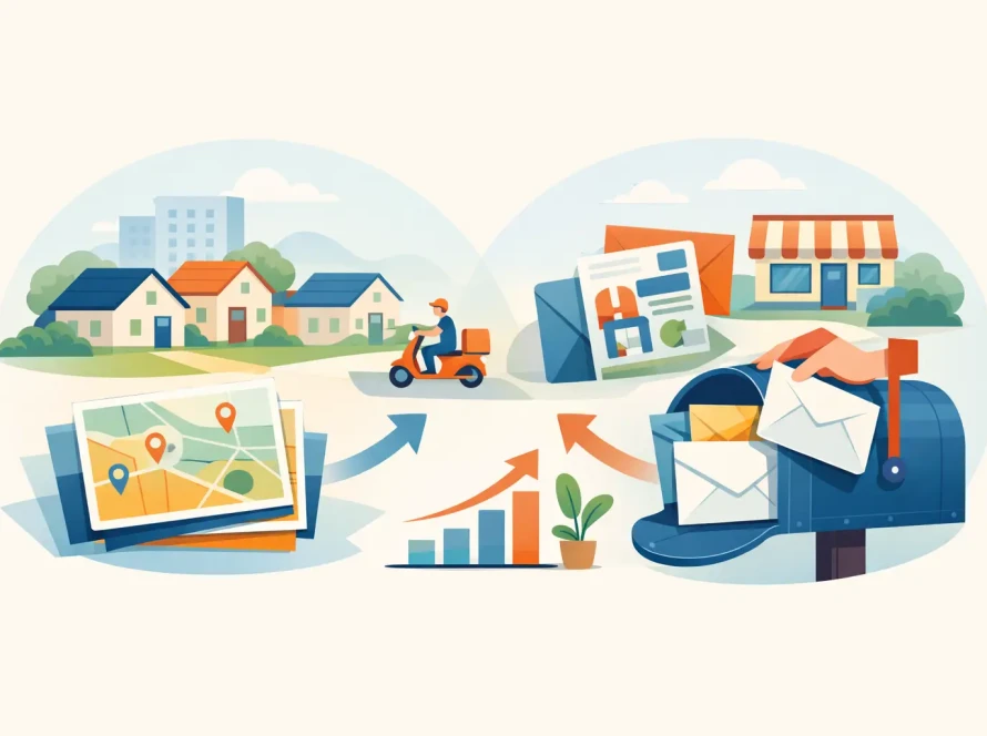
Direct mail works best when printing and distribution are planned together. A strong postcard is only one part of the campaign. You also need the right audience, a mail-ready design, accurate addresses or selected carrier routes, and enough time for production and postal delivery.
Every Door Direct Mail, often called EDDM, can be a smart option for local businesses that want broad neighborhood visibility without purchasing a mailing list. It is especially useful for restaurants, home service providers, medical offices, real estate professionals, fitness studios, and retail openings. You choose postal routes based on the areas you want to reach, then distribute a qualifying mail piece to homes or businesses on those routes.
EDDM is not a precision tool for reaching a narrow list of named prospects. If your campaign requires specific households, existing customers, or tightly defined decision-makers, targeted mailing services may be the better fit. The choice depends on whether geographic reach or audience specificity is more valuable to the offer.
Build your mail piece around one clear next step. Ask recipients to call, scan, visit, book, redeem, or bring in the card. Use a trackable phone number, landing page, QR code, or offer code so you can see what is working. A campaign that cannot be measured is harder to improve.
Select a Print Partner That Can Solve Problems
Price matters, but dependable commercial printing is about more than a line-item quote. Look for clear specifications, responsive communication, realistic turnaround times, and people who ask the right questions before production begins. A printer should help you catch an unsuitable stock, a missing bleed, or a mailing issue before it costs you time.
For recurring needs, consistency matters just as much as speed. Your brochures should match your business cards. Your event banner should use the same brand colors as your postcards. Working with one partner for print, signage, and mailing can reduce handoffs and make it easier to keep campaigns organized. Pink Hippo supports that kind of practical coordination, from standard collateral to custom print and mail projects.
Bring your deadline into the conversation early. Rush production may be available, but shipping, mailing, proof approvals, and specialty finishing can all affect the final timeline. The earlier your printer understands the date that matters, the more options you have.
The best printed materials make it easy for a customer to recognize your business, understand your offer, and take action. Start with the job your marketing needs to do, then choose the format, materials, and production support that give that message a real chance to perform.